Author: David Omotayo
Introduction
Prior to John Gruber's invention of Markdown in 2004, WYSIWYG editors were commonly used for editing content on websites and the web in general. However, Markdown introduced a new era of advanced content editing by providing a simpler way to format elements in plain text documents. Today, Markdown has become one of the most popular markup languages worldwide, enabling web writers to create articles that require HTML without the complexity of writing actual HTML code.
Markdown has gained popularity due to its straightforward syntax, making it accessible to anyone familiar with basic text formatting tools. It offers a wide range of features compared to traditional methods, leading to the widespread adoption of Markdown in enterprise web applications that require text formatting capabilities.
In this article, we will explore the process of integrating the uiw/react-md-editor library into a React application to create a standard Markdown editor.
You can find the example app repo we use in this article here
What is react-md-editor
The React markdown editor, also known as uiw/react-md-editor, is a straightforward yet powerful Markdown editing library developed for React by the UIW (React UI components) team. It offers a seamless text editing experience for creating and modifying Markdown content within a React application.
With the uiw/react-md-editor library, users can easily compose and edit Markdown content through a user-friendly and customizable editor interface. It comes equipped with a variety of features including syntax highlighting, toolbar options for text formatting, real-time preview, and the ability to render Markdown as HTML.
What sets the uiw/react-md-editor library apart from other React markdown libraries is its inclusion of a dedicated "preview" pane, enabling users to instantly visualize their content as they make changes.
Note. Throughout this article, we will refer to the uiw/react-md-editor library as the "React markdown editor" for the sake of simplicity and clarity.
Project setup
In this tutorial, we will create a React application using refine, a React framework designed for developing headless enterprise web applications. We will leverage refine's pre-generated pages and content to illustrate how to incorporate React Markdown into an application that closely resembles a real-world application.
We'll use the npm create refine-app command to interactively initialize the project.
Since this tutorial does not require a complex project setup, we can opt for the following options, which will be more than sufficient for our purposes:
✔ Choose a project template · refine-react
✔ What would you like to name your project?: · refine-markdown
✔ Choose your backend service to connect: · REST API
✔ Do you want to use a UI Framework?: · Ant Design
✔ Do you want to add example pages?: · No
Once the setup is complete, navigate to the project folder and start your app with:
npm install
npm run dev
Once you have executed the commands, the development server will automatically launch the application in a new tab of your default web browser. If, for any reason, the application does not open automatically, you can manually access it by navigating to http://localhost:5173.
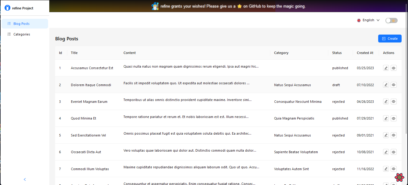
Upon accessing the URL, the application will be displayed, and you should see a similar screen to the image depicted below.
With our project now fully set up and ready for use, we can proceed and integrate the React markdown editor package into our application.
Using the MDEditor component
The first step in integrating the React markdown editor into your project is to install the package as a dependency. To accomplish this, run the following commands:
npm i @uiw/react-md-editor
The next step is to implement theMDEditor component wherever it is required in your project. In our example, we will be using the component within the create and edit pages, where the forms of our application are located.
To begin, import the MDEditor component into the create and edit pages, remove the existing Textarea component from the forms, and insert the MDEditor component as follows:
import MDEditor from "@uiw/react-md-editor";
 ...

<Form.Item
  label={translate("blog_posts.fields.content")}
  name="content"
  rules={[
    {
      required: true,
    },
  ]}
>
  <MDEditor data-color-mode="light" />
</Form.Item>;

  ...
This will render a native Textarea element with support for markdown editing and a preview pane on the form.
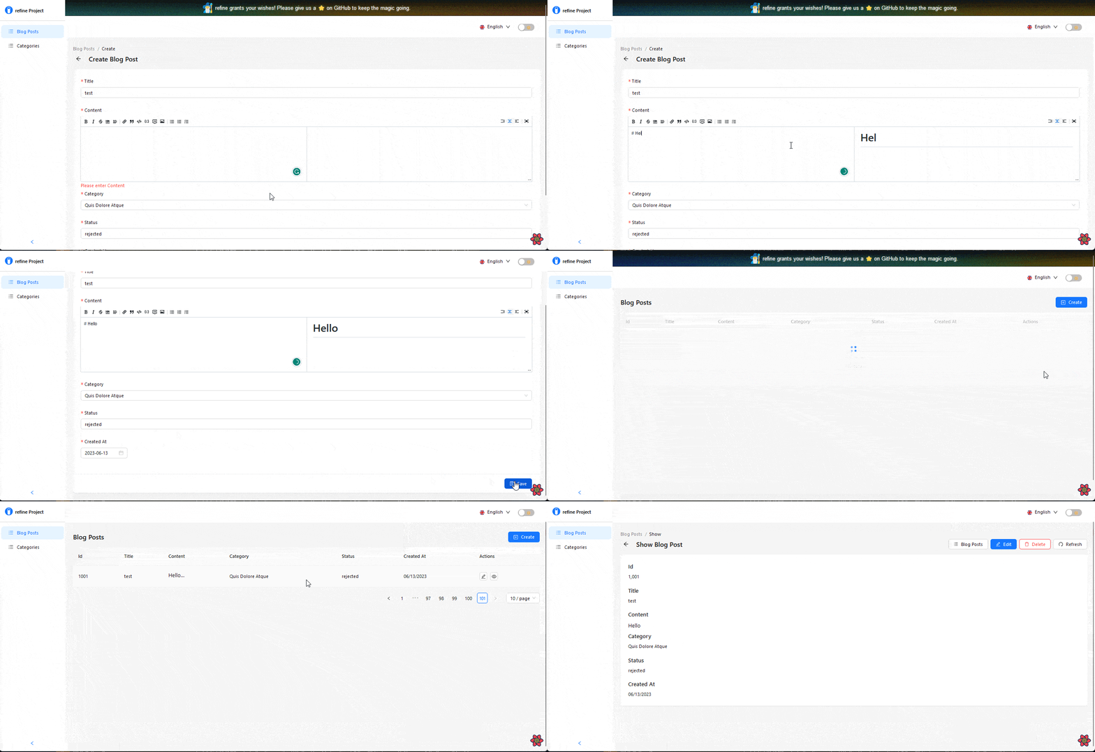
In most cases, utilizing the following props will allow you to render a fully functional React markdown editor within your applications:
value: This prop is used to specify the initial value or the current value of the markdown content.onChange: This prop is responsible for handling changes made to the markdown content.
In our example app, you may notice that we aren't utilizing these props, yet the application is functioning effectively. This is because the Ant Design form component in refine is specifically designed to seamlessly integrate with the React markdown editor package. As a result, it automatically retrieves the markdown value without requiring additional effort.
In a typical React application, it is necessary to create a state to capture and store the markdown value, which is then assigned to the value and onChange props on the markdown editor component. This ensures proper functionality and synchronization between the editor and the markdown content.
import React from "react";
import MDEditor from "@uiw/react-md-editor";

export default function App() {
  const [value, setValue] = React.useState("");
  return (
    <div className="container">
      <MDEditor value={value} onChange={setValue} />
    </div>
  );
}
However, the package offers several additional props that can be utilized to customize the toolbar of the editor and introduce extra functionalities. Below is a list of some of the available properties:
commands
extraCommands
previewOptions
enableScroll
preview
The React markdown editor offers several other properties beyond the ones mentioned above. To explore and learn more about these properties, refer to the documentation for detailed information.
Custom toolbar
The default toolbar provided by the React markdown editor is comprehensive enough, to begin with. However, if you need to further customize the toolbar to better suit your needs, you can use the commands and extraCommand props. These props enable you to implement custom functionality and extend the editor's capabilities based on your individual requirements.
commands prop
The commands prop allows for customization of the commands displayed in the toolbar of the editor. It takes an array of objects that define the specific commands to be included in the toolbar.
When the commands property is provided, it automatically replaces the default toolbar with the custom commands defined. For instance, if we declare an empty array for the commands property on the MDEditor component, the default toolbar commands are overridden:
<MDEditor
  commands={[]}
  data-color-mode="light"
/>
Every command on the toolbar will be removed.

To manually add predefined command properties to the toolbar, you can pass them as objects within the array assigned to the commands property on the MDEditor component, like so:
<MDEditor
  commands={[commands.bold, commands.italic]}
  data-color-mode="light"
/>
This will only render the bold and italic commands on the toolbar.
We also have the flexibility to create custom commands by defining objects with specific properties and passing them to the commands array.
Each object in the array will include various properties that define the command, such as its name, key command, events, and more. Here are some of the primary properties:
name: Specifies the name of the command.keyCommand: Defines the key command associated with the command.buttonProps: Allows the addition of accessibility properties to the command.Icon: Sets an icon for the command on the toolbar.execute: Assigns events or actions to the command.
For instance, if we wish to add a help command to the toolbar, the following code demonstrates how it can be accomplished:
 const help = {
  name: "help",
  keyCommand: "help",
  buttonProps: { "aria-label": "insert help" },
  icon: (
    <svg viewBox="0 0 16 16" width="12px" height="12px">
      <path
        d="M8 0C3.6 0 0 3.6 0 8s3.6 8 8 8 8-3.6 8-8-3.6-8-8-8Zm.9 13H7v-1.8h1.9V13Zm-.1-3.6v.5H7.1v-.6c.2-2.1 2-1.9 1.9-3.2.1-.7-.3-1.1-1-1.1-.8 0-1.2.7-1.2 1.6H5c0-1.7 1.2-3 2.9-3 2.3 0 3 1.4 3 2.3.1 2.3-1.9 2-2.1 3.5Z"
        fill="currentColor"
      />
    </svg>
  ),
  execute: () => {
    window.open("https://refine.dev/", "_blank");
  },
};

return (
  <Form.Item
    label={translate("blog_posts.fields.content")}
    name="content"
    rules={[
      {
        required: true,
      },
    ]}
  >
    <MDEditor
      commands={[commands.bold, commands.italic, help]}
      data-color-mode="light"
    />
  </Form.Item>
);
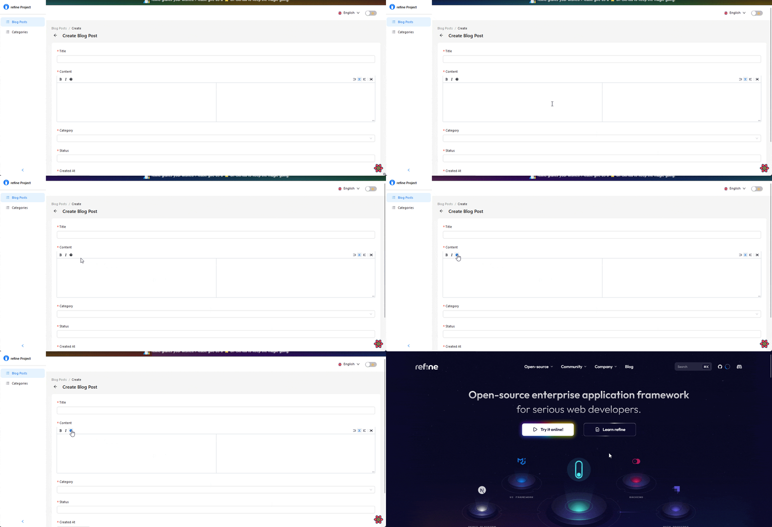
Here, we create a help object and assign the previously mentioned properties to define the command. This includes specifying a name, keyCommand, buttonProps, and icon. Additionally, an event is assigned to execute when the command is clicked, which opens refine's documentation in a new window.
execute: () => {
  window.open("https://refine.dev/", "_blank");
},
Then, we pass it to the commands array on the MDEditor component:
<MDEditor
  commands={[commands.bold, commands.italic, help]}
  data-color-mode="light"
/>
extraCommands prop
The extraCommand property serves the same purpose as the commands property. It is an array of objects that define the commands displayed on the toolbar. However, it is specifically used to add additional commands to the toolbar, and these commands are positioned on the right side of the toolbar.
This indicates that the preview and fullscreen commands displayed on the toolbar are predefined extra commands.
We can add custom extra commands using the same approach as the commands prop.
<MDEditor
  commands={[commands.bold, commands.italic, help]}
  extraCommands={[
    commands.title1,
    commands.title2,
    commands.codePreview,
    commands.codeEdit,
  ]}
  data-color-mode="light"
/>;
Also, you have the option to assign either predefined command objects or create custom ones, as demonstrated in the following example from the documentation:
    import React, { useContext } from "react";
    import MDEditor, { commands, EditorContext } from "@uiw/react-md-editor";

            ...

      const Button = () => {
        const { preview, dispatch }: { preview?: any; dispatch?: any } =
          useContext(EditorContext);
        const click = () => {
          dispatch({
            preview: preview === "edit" ? "preview" : "edit",
          });
        };
        if (preview === "edit") {
          return (
            <svg width="12" height="12" viewBox="0 0 520 520" onClick={click} />
          );
        }
        return (
          <svg width="12" height="12" viewBox="0 0 520 520" onClick={click} />

        );
      };

      const codePreview = {
        name: "preview",
        keyCommand: "preview",
        value: "preview",
        icon: <Button />,
      };

            ...

      return (
        ...

      <Form.Item
        label={translate("blog_posts.fields.content")}
        name="content"
        rules={[
          {
            required: true,
          },
        ]}
      >
        <MDEditor
          commands={[commands.bold, commands.italic, help]}
          extraCommands={[codePreview]}
          data-color-mode="light"
        />
      </Form.Item>
In this example, the EditorContext is employed to dispatch an action that combines two preview functionalities (preview and edit) into a single command using conditionals. When clicked, the command toggles the editor's preview state from edit to preview and vice versa.
Adding custom preview
A markdown editor is capable of performing complex computational editing tasks, including rendering TeX mathematical equations and generating diagrams and flowcharts from text. While the React markdown editor doesn't include these functionalities by default, it offers the option to integrate with libraries like kaTeX and mermaid preview.
To integrate the kaTeX library with the React markdown editor package in your application, open up your terminal and execute the following commands:
npm install katex
This command will install the kaTeX package as a dependency of your project.
Similarly, you can integrate the mermaid preview library by following the corresponding steps outlined in its documentation.
KaTeX preview
kaTeX is a JavaScript library designed for rendering TeX mathematical expressions on the web. The React markdown editor utilizes kaTeX as a plugin to preview mathematical expressions.
To add it to your editor, you must first import the package and its peer-style dependency into your component, which in our case is the create and edit files:
import katex from "katex";
import "katex/dist/katex.css";
Then, we'll configure the editor to format and preview kaTeX expressions as mathematical expressions by assigning the previewOptions prop to the MDEditor component using the following code:
<MDEditor
  data-color-mode="light"
  previewOptions={{
    components: {
      code: ({ inline, children = [], className, ...props }) => {
        const txt = children[0] || "";
        if (inline) {
          if (typeof txt === "string" && /^\$\$(.*)\$\$/.test(txt)) {
            const html = katex.renderToString(
              txt.replace(/^\$\$(.*)\$\$/, "$1"),
              {
                throwOnError: false,
              },
            );
            return <code dangerouslySetInnerHTML={{ __html: html }} />;
          }
          return <code>{txt}</code>;
        }
        const code =
          props.node && props.node.children
            ? getCodeString(props.node.children)
            : txt;
        if (
          typeof code === "string" &&
          typeof className === "string" &&
          /^language-katex/.test(className.toLocaleLowerCase())
        ) {
          const html = katex.renderToString(code, {
            throwOnError: false,
          });
          return (
            <code
              style={{ fontSize: "150%" }}
              dangerouslySetInnerHTML={{ __html: html }}
            />
          );
        }
        return <code className={String(className)}>{txt}</code>;
      },
    },
  }}
/>;
The code above is specifying how the code component should behave when it encounters inline or block-level code elements. If the code is inline and contains a KaTeX expression (indicated by $$), it will be rendered using the KaTeX library. If the code is block-level and has a language-katex class, it will also be rendered using the KaTeX library. Otherwise, the code will be displayed as plain text.
Now, if we input KaTeX expressions into the editor, they will be previewed as mathematical expressions.

Sanitize Markdown
Markdown inputs need to be parsed into HTML elements before they can be rendered in a browser. However, this parsing process can create a potential vulnerability for cross-site scripting (XSS) attacks.
XSS is a common security vulnerability found in web applications, allowing malicious users to inject client-side scripts into web pages, bypassing access controls like the same-origin policy.
To mitigate this risk, it's important to sanitize the markdown text by removing any potentially harmful HTML tags and attributes. This ensures that user inputs are properly formatted without compromising the security of your application.
rehype-sanitize plugin
To prevent the entry of malicious scripts in the input area and protect our application, we need to sanitize the parsed HTML to ensure its safety before rendering. This is where rehype-sanitize comes into play.
rehype-sanitize is a security plugin used by the React markdown editor package to handle sanitization within its editor. It provides a reliable way to sanitize the HTML content and mitigate any potential security risks.
Integrating the rehype-sanitize plugin into our application is a straightforward process. We simply need to install the package as a dependency using the following command:
npm install rehype-sanitize
Then, we import the rehypeSanitize function into the create and edit files as follows:
import rehypeSanitize from "rehype-sanitize";
Finally, we pass it as a value to the rehypePlugins property on the previewOptions props, as shown in the code below:
<MDEditor
  data-color-mode="light"
  previewOptions={{
    rehypePlugins: [[rehypeSanitize]],
  }}
/>;
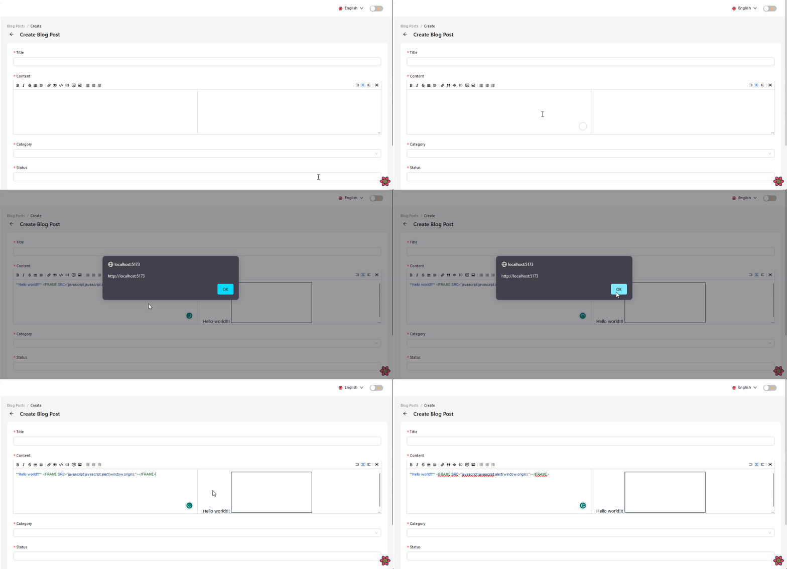
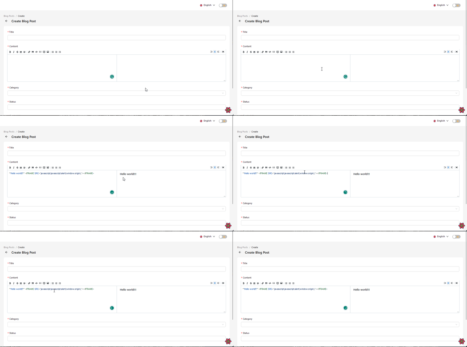
Now, if you try to parse malicious codes into the editor, the rehype-sanitize plugin will remove the code before previewing the content. The GIFs below provide a clear demonstration of this in action.
Before integrating rehype-sanitize:
After integrating rehype-sanitize:
Conclusion
We have covered a substantial amount on integrating a markdown editor into a React application using the uiw/react-md-editor library. However, there is much more to explore with the markdown editor.
For a comprehensive understanding and implementation of advanced features, I recommend referring to the official documentation. It is essential to consult the documentation and explore the examples provided by the library's creators to gain detailed instructions and discover additional usage options.


